Posts

Showing posts from June, 2023

Job, Alphonse Mucha

Image
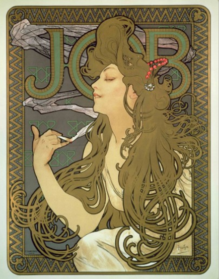
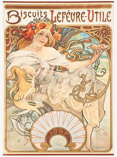
  In this advertisement for cigarette paper, there is a central female figure. This lithograph print displays Mucha's whiplash curves. The flowing of her hair help as a visual leading line. This artwork is adorned with decorative elements around the border. The bold text behind the women's head is balanced well. This particular print is different from Biscuits Lefevre Utile. The colors used within this artwork are much darker and the balance is weighted differently. Some similarities are, of course, those whiplash curves, organic shapes, and asymmetry.  Mucha, Alphone. Job. 1896. 

Ambassadeurs: Aristide Bruant, Henri Toulouse-Lautrec

Image
 In this black and white print, there is a women standing with a cane. The figure is flattened using bold, black lines. In this composition there is hand written text across the top and bottom. This image is balanced asymmetrically using contrasting values. There are dynamic lines throughout the image, for example the cane is help at an angle. These traits are all characteristics of Art Nouveau. It's important to study and analyze multiple artists artwork. Toulouse-Lautrec, Henri. Ambassadeurs: Aristide Bruant. 1892. Metropolitan Museum of Art, New York City. 

Cover of Jugend Magazine, Umschlag der Kunst- und Literaturzeitschrift, Fritz Erler

Image
On this cover of Jugend magazine there is a feminine figural riding a bird. The image is framed with a bold black line. At the top of the page, behind the figure, the title for the publication is hand drawn. There is a cityscape at the bottom of the page and in the distance there is whimsical outlines of clouds. In this print, there is depth and there is traits of the Art Nouveau movement. The Jugend publication was an important contributor to the spread of the movement. This image was important in showcasing the trends that were unfolding in Germany.  Erler, Fritz.  Umschlag der Kunst- und Literaturzeitschrift. 1897.

Shaw oder die Ironie, Egon Schiele

Image
  In this poster for a music festival, there is a portrait above carefully pace text in legible font. While this poster is visually different from that of Mucha or Klimpt artwork, it's still an important part of Art Nouveau. The image carries symbolic meaning. In this image there is no whiplash curves or floral motifs, although the shape of the face and it's fold create organic shapes. The colors used within this poster are neutral earth tones.  Schiele, Egon. Shaw oder die Ironie. 1912. Modern Museum of Art, New York City. 

Poster for the 14th exhibition for the Viennese Secession, Alfred Roller

Image
In this image there is a simplified figure holding a sphere. within this poster, there is rhythm and movement captured by the reputation of pattern. Above the text, there is hints of waves. Alfred Roller created this poster for the 14th exhibition for the Vienna Secession. While this image is different from the work happening in France during the Art Nouveau movement. It's an important piece because of it's innovative design strategies. Roller, Alfred. Poster for the 14th exhibition for the Vienna Secession. 1902.

The Glasgow Institute of the Fine Arts, Margaret, Frances Macdonald & J Herbert McNair

Image
 In this poster advertising the Glasgow Institute of The Fine Arts, there is an androgynous central figure. The figure is elongated, linear and stylized. This poster was a collaborative effort between 'The Four.' There are floral motifs that surround the edges of the poster. The choice of colors used are muted earth tones. While this collaborative work is unique in it's own way, it also carries many traits of the Art Nouveau movement.     Macdonald, Margaret & Frances. McNair, J Herbert. The Glasgow Institute of the Fine Arts. 1895. Modern Museum of Art, New York City. 

Bubbles, Sir John Everett Millais

Image
In this image we see little boy playing. The child is gazing up at bubble floating above him. The painting was made by Sir John Everett Millais. In 1886, Thomas Barratt purchased the painting. Barratt then delicately added the Pear's Soap text above the child and printed many lithographs of the image. This is a great example of how fine art and advertisement meshed together. While this image doesn't have all the same characteristics of Art Nouveau as my other post, it's still considered new art. This was an important poster, which tied graphic design and poster art to the world of fine art.  Millais, John Everett. Bubbles. 1886

Absinthe Robette, Alphonse Mucha

Image
  In this image, there is a sensual figure holding a glass of absinthe. The women is wearing shear drapery which exposes her hips and breast. The colors are muted in this pieces. In the background there are scrolls of smoke and floral pattering. These traits are important to the Art Nouveau movement. Mucha's signature whiplash curves are portrait thorough this image. This particular piece is very different from that of  Leonetto Cappiello  in  Contratto. In this image there is more depth to the composition. Much was an iconic figure and an important designer who came out of this art movement.  Mucha, Alphonse. Absinthe Robette. 1896.

Harper's Magazine- February, Edward Penfield

Image
In this image, there is a group of people sitting on a bus and each one of them is holding a magazine. This composition is very dynamic with it's asymmetry. The bold outlined figures are reminiscent of a Japanese woodblock print. The color palleted use within this poster consist of earth tones. Penfield hand drew the text at the bottom of the image. This poster is completely different to that of Much in Absinthe Robette. There is no arabesque or whiplash curves. In this image, Penfield chose to display a group of people instead of a central female figure. Yet, Harper's Magazine played an important role in spreading the new style.  Penfield, Edward. Harper's Magazine- February. 1897. Metropolitan Museum of Art, New York City. 

Contratto, Leonetto Cappiello

Image
In this image there is a woman under a wine glass. It seems as thought she is holding it up. Her expression seems happy because she is smiling. The background is solid black and the colors that are used around the figure are earth tones. There is organic material flowing underneath the wine glass. These qualities point to Art Nouveau style. However, unlike Privat-Livermont this image has less flowing curves and floral patterns. This design is simple, there is one central focus with less detailed pattering in the background. This is an important piece because Leonetto branched Art Nouveau into Le Rire which was satirical publications. His posters were distinctly his own and unlike other Art Nouveau artists yet still carried element of the movement.  Cappiello, Leonetto. Contratto. 1922. 

Jane Derval Folies- Bergère, Georges de Feure

Image
In this poster we see a women wearing a red dress. The garment is decorated with floral design. In the background there are organic patterns. The background is a gray color that contrast to her bright red dress. The text within this poster seems to be hand made. The qualities listed link to Art Nouveau. Unlike Alphonse Much, this women seems to fill the page with less ornate qualities. There is no intricate  pattern filling the background. This image is important representation of other types of Art Nouveau style. It's key to understand the different style that came out this movement.  (Paris, 1904) Feure, Georges. Jane Derval Folies- Bergère. 1904. 

L'Amant des Danseuses Roman Moderniste par Félicien Champsaur, Jules Chéret

Image
 In this poster there is a central female figure, who looks like she is a performer. In her hands she is holding a drum. The women is wearing a bright yellow cabaret dress. There are silhouettes of people in the background and a clearer male figure. The colors that are used to create this poster are dulled hues of blue and lemon in the background. While the colors used within the foreground are more saturated and stand out. In this image there is many stylistic qualities of Art Nouveau. The main figure is portrayed in a sensual manner. Unlike Will Bradly, this lithograph seems flow and have more organic qualities. This image is important to be because it distinguishes the Rocco Style of Art Nouveau.  Chéret, Jules. L'Amant des Danseuses Roman Moderniste par Félicien Champsaur. 1896.  The New York Public Library Digital Collections. New York City.

Encre L. Marquet, Eugène Samuel Grasset

Image
This image shows an central female figure looking off in the distance. The woman's hair flows across the page. On top of her head is floral crown, her dress show organic patterns. She holds a quill and paper in her hands. The text within this image seems to be hand made. The colors used this poster are earth tones.  The elements used within this lithograph mirrors the characteristics of the Art Nouveau movement. Unlike Cheret, Grasset's style seems to mimic woodblock prints. It's important to understand how artist develop their style.  Grasset Eugene Samuel. Encre L. Marquet. 1892. Los Angeles County Museum of Art. Los Angeles.   

The Scottich Musical Review Poster, Charles Rennie Mackentosh

Image
  This images show an  androgynous figure  elongated along the poster. Mackentosh is experimenting with rich green and blue color, next to earth tones. This lithograph has   plant and bird forms are integrated into abstract patterns.  Mackentosh had no formal training in design.  Charles along with the  Glasgow group  experiment with their own approach to design. I think it's important for artist to navigate their own sense of design composition. This group did just that. Mackentosh, Charles Rennie.  The Scottich Musical Review Poster.  1896. The Museum of Modern Art, New York City. 

Cover of Jugend, Otto Eckmann

Image
In this design there is a woman to the right razing off in the distance. Organic flowers fill the negative space around her. Dark luscious locks flow around her face and a foral crown adorns the top of her head. Otto Eckmann creating this for the the cover of Jugend magazine around 1896. Different than other artists of the Art Nouveau movement, Eckmann used wood block prints to create this magazine cover.  The visual balance within this magazine cover is similar to the work produced by Moser. The nymph-like female is similar to Mucha's. However, unlike others of the Art Nouveau movement, Eckmann is thinking about space in her artwork. This image consists of a foreground and background. It's important to understand how artist were working as graphic designers. I'm drawn to the similarities to Ukiyo-e woodblock prints.  Eckmann, Otto. The Cover of Jugmend Magazine. 1896.

The Twins, Will H. Bradley

Image
The main subject of this magazine cover is two identical women overlapping each other. Both female figures are dressed in flowing attire and seem to be holding a plate of berries. Bradley created this image in 1895 for Chap Book Magazine. The image has striking resemblance to Moser's   Fromme’s Kalender. For example both images use muted earth tones along side black which echo a qood block print. In the image, emphasis is placed women by the curving lines. In this artwork there is a sense if movement through the flowing lines. It's important to understand where graphics design started being pushed into a new movement. Bradley,  Will. The Twins. 1895, The Metropolitan Museum of Art, New York City. 

Fromme’s Kalender, Koloman Moser

Image
In this image there is a central female figure.  She's depicted from a profile veiw. In this composition,  the woman is off center, her hands clasp together while she holds a hour glass. Flowers are pin some of her hair in a bun, while the rest flows down her waist. The text in this print is weighted at the bottom of the page.  Moser was technically apart of the Vienne Succession, which is closely related to Art Nouveau. The close relationship is appartement in his color palette, use of curves, and asymmetry. This work reminds me of how Steinlein uses pops of earthy colors against black. The proportions of this poster also reminds me of Tournee du Chat Noir. It's important to understand the distinction between different artists and how they were inspired by each other. Moser, Koloman. Fromme’s Kalender. 1899, Museum of Fine Art Boston, Boston.

L'ESTAMPE ORIGINALE, CAMILLE MARTIN

Image
This lithograph print was made in 1895 by artist, Camille Martin. There is very little information known about this particular artist. However, he created this iconic poster for one of the most influential publications in the history of print collecting. Between 1893 and 1895  L'Estampe Originale issued prints to subscribers on a quarterly basis. It's important to understand how influences a print can become despite not much being know about the artist.  This artwork is created with with earth tones similar to that of Lautrec. In this print there flowing organic material circulating the page which is familiar to Klimt. Martin's use of elegant decorative elements bridges to the movement of Art Nouveau.  Martin, Camille.  L'ESTAMPE ORIGINALE.  1895, Swann Galleries Inc., New York City.

Rajah, Henri Privat-Livemont

Image
 In this image, there is a central female figure. This woman is dressed in a flowing top, she wears a cap on her head and holds a cup of tea in her hand. Her clothing is decorated with intricate designs. The steam from the tea cup flows around the title, "Rajah" on top of the page. The background color is a shade of rust that compliments the green in her outfit.  Henri Privat-Livemont created this color lithograph print in 1899. This Belgium artists is known for his Art Nouveau posters. The way he created "Rajah" reminds me of the artwork of Mucha and Klimt. Particularly, the use of curves and ornate designs surrounding a sensual female figure. Henri Privat-Livemont is not as well known as Mucha or Klimt but his work doe not disappoint.   I'm drawn to Art Nouveau because of the elegant work that was produced during this period. It's fascinating to see artists that are not as popular.  Privat-Livermont, Henri. Rajah. 1899, Museu Nacional d'Art de Cataluny...

Tournée du Chat Noir de Rodolphe Salis, Théophile Steinlen

Image
This poster displays a black cat sitting on top of a red banner. Behind the cat's head is an ornate circle. Inside the circle there is deliquiate inscriptions patterns. The text that is included within this poster seems to be hand written. The colors used to create this poster are dull red, ochre and black. The stylistic elements used within this artwork hint towards Art Nouveau.   This color lithograph poster was created by Théophile Steinlen in 1896 for the Chat Noir, an artistic cabaret in Paris. Steinlen's career was launched at the Chat Noir, where he continued to make advertisements. Like Lautrec's poster Moulin Rouge: La Goulue, this poster uses dull earthy colors. Similar to Mucha and Beardsley the use of curving lines draws the viewer around the page. It's crucial to understand how graphic design was shaping during this period.  Steinlen, Théophile.  Tournée du Chat Noir de Rodolphe Salis.  1892, Museum of Montmartre, Paris...

Salome, Aubrey Beardsley

Image
In this image high contrast print, there is an elongated figure. The figure is outlined and is place in the top portion of the page. Curving, organic lines sweep around the page. The overall contrast in colors creates a diagonal curve across the page. The text within this image seems to be hand written. Beardsley created this artwork in 1892 for Oscar Wilde's Salome.  This artwork stands out as Art Nouveau with the use of flowing, organic motifs, and the outlined figure. Unlike Much and Klimt, we see a central male figure. However, there are subtle feminine qualities, such as the flowing gown and hair. This high contrast black and white image has deliquiate patterning that imitates that of Alphonse Mucha. It's important to understand how the movement expanded into other realms of graphic design.  Strickland, Carol, and John Boswell. “Art Nouveau .” The Annotated Mona Lisa: A Crash Course in Art History from Prehistoric to the Present , Andrews McMeel P...

Judith and the Head of Holofernes, Gustav Klimt

Image
Gustav Klimt created this painting in 1901. In this oil painting of the biblical heroine Judith, we soft yet angular features. The gold leaf outlines Judith, almost flattening the image. The repetition of pattern emphasizes Judith's face. There is natural lines and shapes forming within gold leaf. The color palette employs mostly earth tones, aside from the vibrant use of gold leaf which can be traced as an earth element. The painting finished using a top heavy frame. The title along with ornate texture fills the space within the frame.  The elements and style in which Klimt painted lends to Art Nouveau. Comparable to Mucha, Gustav employs the use of softening the figure making it almost dream-like. The use of a central female figure, along with flowing curves echoes the work of Alphonse Mucha. In this image of Judith there is high contrast that familiar to Lautrec's, "Moulin Rouge: La Goulue." I'm always admired the art work of Gustav Klimt, so it was fascinati...

Biscuits Lefevre Utile, Alphonse Mucha

Image
In this poster there is a a beautiful woman holding a plate of biscuits, in the background there is an elaborate flow of organic line patterns. There is visual balance created by the hand painted text above the women. Within this advertisement, there is movement lines created by the organic filigree lines. Mucha was conscious about composition when he chose to place the figure slight off center.  Alphonse Mucha created this work in 1987 for the French company Lefevre Utile. Throughout this career he created many brand advertisements and posters for theatre shows. Mucha is known for beginning the Art Nouveau style. Although he distanced himself from the title because he thought art should be timeless and he didn't want to be included in a contemporary group. His work always depicts a famine figure with ornate floral pattern surrounding the figure. Show in Alphonse's artwork, everything is created by hand including the text. Similar t...

Moulin Rouge: La Goulue, Henri de Toulouse-Lautrec

Image
Displayed within this poster for Moulin Rouge there are is a crowed of people depicted as silhouettes in the background. In the foreground, there are two main figures displayed, a cabaret and a gray male silhouette performer. Lautrec created this poster in 1891, this painting was hung in the front entrance of the nightclub. Henri was commissioned to create six-foot-tall advertisements that launched his career as a poster maker.  This painting display elements of Art Nouveau well. This image was created with an earthy color palette. Everything looks created by hand, including the text. Within this work of art, there is natural and organic shapes. It's important to understand how and why artists created their work. This is a well known image, I've seen it many times. It's fascinating to understand the history of this piece.  Toulouse-Lautrec, Henri. Moulin Rouge: La Goulue. 1891, The Metropolitan Museum of Art, New York City.

Introduction and ideas for research topic

 Hello, hello!! I'm excited to dive into visual communication design history. Over the next few weeks, I will share my insights as I navigate along this journey of learning the history of visual communication.  I'm drawn the art nouveau style so I will be selecting this graphic design style for my independent research.